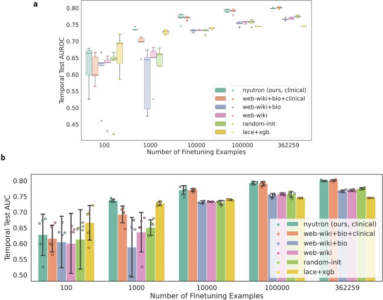
Extended Data Fig. 7. Detailed statistics of the comparison between language models and lace+xgb.
a, A box plot with individual data points. For each model, 5 experiments were run using random seeds 0, 13, 24, 36, 42. The centerline of the box plot indicates the median. The upper line of the box indicates the first quantile. The lower line of the plot indicates the last quantile. The whisker extends to 1.5 times the interquartile length and the diamonds indicate outliers. b, A bar plot that shows the mean and standard deviation. The height of the bar indicates the mean across 5 experiments and the length of the black vertical line indicates the standard deviation.

