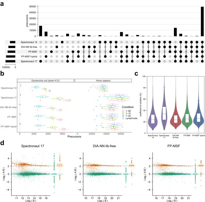
Fig. 2. Performance assessment of sensitivity, false discovery rate, precision, and accuracy using a benchmark dataset.
Source data are provided as a Source Data file. a Upset plot illustrating the quantified precursors. The precursors are from all four conditions of both H. sapiens and E. coli. b Box plots representing the counts of quantified precursors under four distinct conditions, each with a unique color. There are 4 independent conditions. Each condition consists of 23 single-shot DIA runs from 23 biological independent samples. The “Lymphnode” condition comprises samples from H. sapiens, while the remaining three conditions include both H. sapiens and E. coli spike-in samples. H. sapiens and E. coli precursors are displayed in separate panels. E. coli precursors in the “Lymphnode” condition are deemed false identifications. The box in each box plot captures the interquartile range (IQR), with the bottom and top edges representing the first (Q1) and third quartiles (Q3) respectively. The median (Q2) is marked by a horizontal line within the box. The whiskers extend to the minima and maxima within 1.5 times the IQR below Q1 or above Q3. Outliers, signified by individual dots, fall outside these bounds. c Violin plots showcasing the coefficient of variation (CV) based on E. coli precursors from the “1–06” condition. There are 23 replicates. Each violin plot contains an embedded box plot. The box plots’ edges, median, and whiskers are same as the previous ones. d Scatter plots depicting the relationship between protein log2 ratio and intensity, using proteins from the “1–06” (condition A) and “1–25” (condition B) conditions to compute log-ratios. There are 2 conditions. Each condition contains 23 replicates. E. coli proteins are colored orange, while H. sapiens proteins appear in green. Horizontal dashed lines indicate true log-ratios, while adjacent box plots display the marginal distribution of log-ratios on the right side of each scatter plot. The box plots’ edges, median, and whiskers are same as the previous ones.

