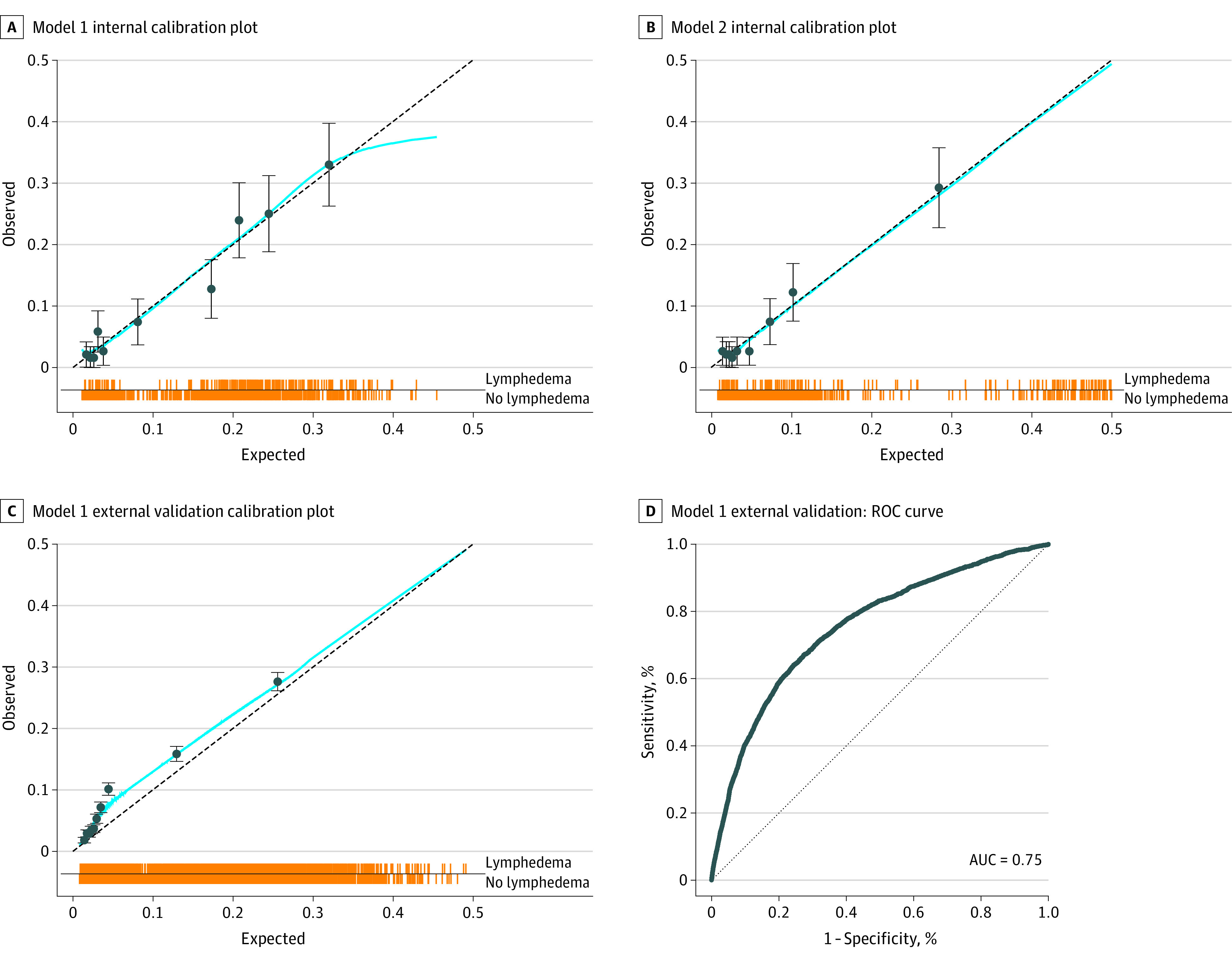
Figure 2. Calibration and Validation Receiver Operating Characteristic (ROC) Plots.

A, Calibration plot of observed vs expected values for model 1. B, Calibration plot for model 2. C, Calibration plot for model 1 external validation with the Memorial Sloan Kettering Cancer Center International Classification of Diseases data set. D, Receiver operating characteristic (ROC) curve for model 1 external validation with the Memorial Sloan Kettering Cancer Center International Classification of Diseases data set. Each line of the spike plots directly above the x-axis represents an individual data point. Data are subdivided into 10 groups based on deciles within each calibration plot. Error bars indicate 95% CIs. AUC indicates area under the ROC curve.
