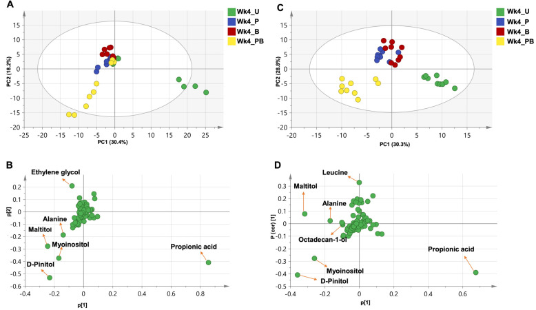
Figure 9.
PCA and OPLS analysis for week 4 treatment groups normalized to week 0 time point. (A,B) PCA for week 4 treatment groups. This model was explained by five components with total variance = 0.775 and prediction power = 0.103. (A) Score plot of PC1 vs. PC2, showing a separation between two clusters (one for the untreated group and one for the rest of the groups). (B) Loading plot for PC1 and PC2 showing the major metabolites contributing to sample clustering. (C,D) OPLS for week 4 treatment groups. This model was explained by three components with total variance = 0.888 and prediction power = 0.745. (C) Score plot of PC1 vs. PC2 showing three clusters. (D) S-Plot for PC1 and PC2 showing the major metabolites (trimethylsilylated) contributing to sample clustering. U = untreated; P = pomegranate; B = benzo[a]pyrene; PB = pomegranate + benzo[a]pyrene.

