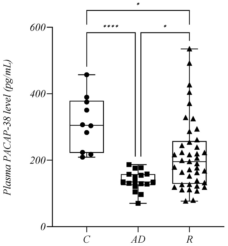
Figure 3.
The plasma PACAP-38 levels in the control group (C), in patients with active disease (AD) and in remission (R). The box plot diagram represents the interquartile range and median values. Whiskers indicate the most extreme observations. The individual values are presented with black dots (control group, n = 10), squares (patients with AD, n = 17), and triangles (patients in R, n = 41). The Kruskal–Wallis with Dunn’s multiple comparison test was used for statistical analysis. * p ≤ 0.05, **** p ≤ 0.0001.

