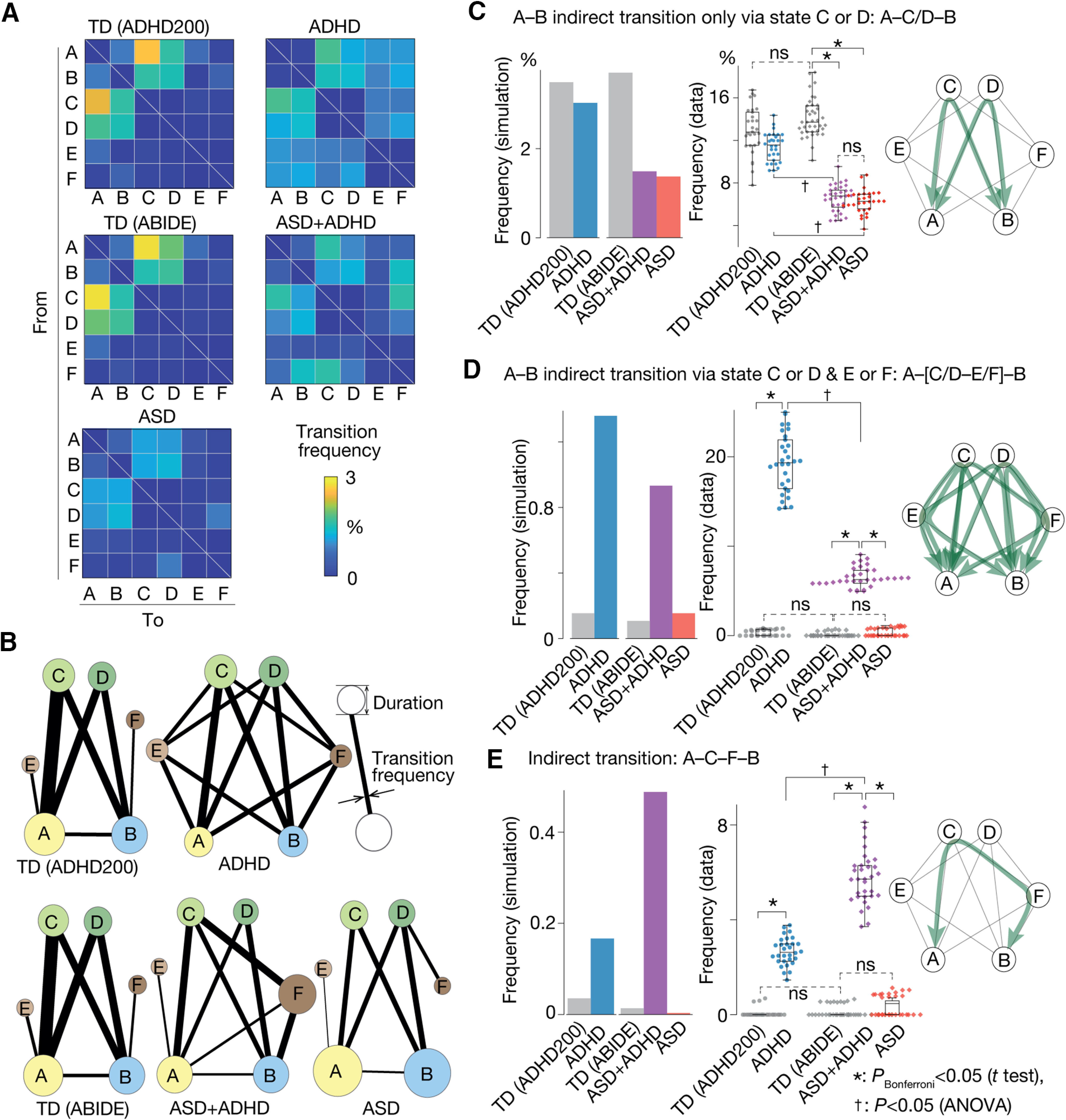
Figure 2.

Brain state dynamics. A, Transition frequency matrix. A cell (i, j) represents the frequency of the transition from brain state i to j, which was calculated by a random-walk simulation. B, The graphs show the transition frequency (thickness of the lines) and duration (radius of the circle). C–E, Three brain state transitions whose frequencies appeared to be specific to ASD/ADHD symptoms: panel C indicates the ASD symptom-specific reduction in the A–C/D–B transition frequency; panel D represents ADHD-specific enhancement of the A–[C/D–E/F]–B transition; panel E shows the ASD+ADHD comorbidity-specific increase in the A–C–F–B transition frequency. In every panel, the left bar graphs are based on the random-walk simulation, whereas the middle graphs are based on the empirical data. The right network schemata represent the patterns of the corresponding brain state transitions. *pBonferroni < 0.05 in a two-sample t test. †p < 0.05 for interaction in a two-way ANOVA.
