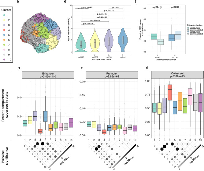
Fig. 3. The A compartment clustering reveals differential accumulation of chromatin states and gene regulatory landscapes.
a iGraph layout of the A compartment clusters after UMAP dimensionality reduction and Louvain clustering. Each circle represents an A compartment. Colors represent the ten clusters that were identified. The size of the circles is proportional to the level of co-accessibility of that A compartment, showing that clusters 1, 2, 3, and 5 have the highest levels of co-accessibility. The A compartment cluster coverage of enhancer (b), promoter (c), and quiescent (d) ChromHMM chromatin states are indicated with boxplots. Overall p values (top) correspond to the two-sided Kruskal–Wallis test comparing the coverage across the A compartment clusters. The p value map below the plot denotes which pairwise differences are significant (p < 0.05) in the post hoc Dunn test, after correcting for multiple testing using the Holm procedure. The number of compartments in each cluster is listed in Supplementary Table 4. e Violin plots with inlaid boxplots show the number of pCHi-C interactions per promoter in the four A compartment clusters. The overall p value corresponds to the two-sided Kruskal–Wallis test and the pairwise comparisons denote the p values from the post hoc Dunn test, after correcting for multiple testing using the Holm procedure. The violin plot shows the kernel probability density of the data. f Boxplots show the proportion of ATAC peaks in the cluster A compartments that are upregulated (higher accessibility in D1 relative to PAd) or downregulated (lower accessibility in D1 relative to PAd) after 24 h of PAd differentiation into adipocytes. The p values correspond to the two-sided paired Wilcoxon rank-sum test for differences between the proportion of up- or down-regulated peaks in each of the compartment clusters separately. See also Supplementary Figs. 7, 8, Supplementary Data 5, 6, and Supplementary Table 4. For all boxplots, the center represents the median gene density of the compartment type, the upper and lower bounds of the box represent the 75th and 25th percentile, respectively, and the upper and lower whiskers represent the highest (non-outlier) and lowest (non-outlier) values, respectively. Source data are provided as a Source Data file.

