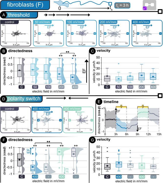
Figure 3.
Fibroblasts—Threshold determination—(A) Cell tracking in microfluidic device µ1. Hairline plots represent individual movement over 3 h for non-stimulated and stimulated cells at different electric fields between 50 and 400 mV mm−1 (n = 50). Migration statistics (B) directedness and (C) velocity. Polarity switch—(D) Hairline plots for movement over 3 h for non-stimulated and stimulated cells at alternating electric fields of 400 mV mm−1 (n = 50). (E) Timeline of polarity switch experiment. Dots represent average every 3 min and shaded area represents standard deviation. Migration statistics (F) directedness and (G) velocity. | For all box plots, the box represents the 1st and 3rd quartiles, middle line shows the median, * denotes the mean value, the whiskers represent the max. and min. values, respectively, and circles represent outliers. + +p < 0.01 when compared to the control with no EF. **p < 0.01 when compared amongst stimulated cells of different EF.

