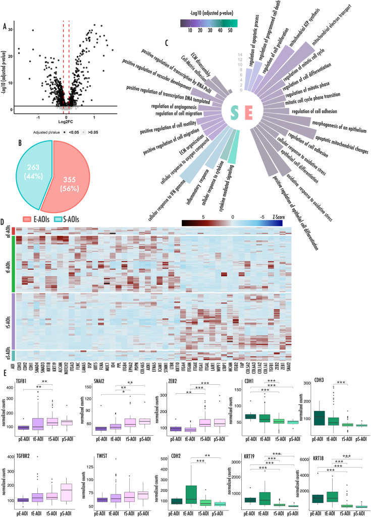
Fig. 2.
Principal biological processes involved in E to S transition
(A) Volcano plot showing differentially expressed genes between E-AOIs and S-AOIs. Black dots represent significantly deregulated genes (adjusted p-value < 0.05). Red lines represent fold change threshold (FC) |0.1| (B) Pie chart showing the number and relative percentage of differentially expressed genes upregulated in E-AOIs and S-AOIs. (C) Circular histograms representing principal biological processes upregulated in Epithelioid (right) and Sarcomatoid (left) regions of interests. Color legend expresses the level of significance of each enriched category. The graduated axis represents the fraction of genes involved in each biological process and deregulated in our setting. (D) Heatmap representing expression of all deregulated EMT-TFs and markers in the 4 AOI groups. Color gradient expresses the z-score of each gene in each sample. (E) Box plots representing the expression level of EMT markers (green) and upstream regulators (pink) across the different AOIs. In this figure p-values are represented as follow: *<0.05, **<0.01 ***<0.001

