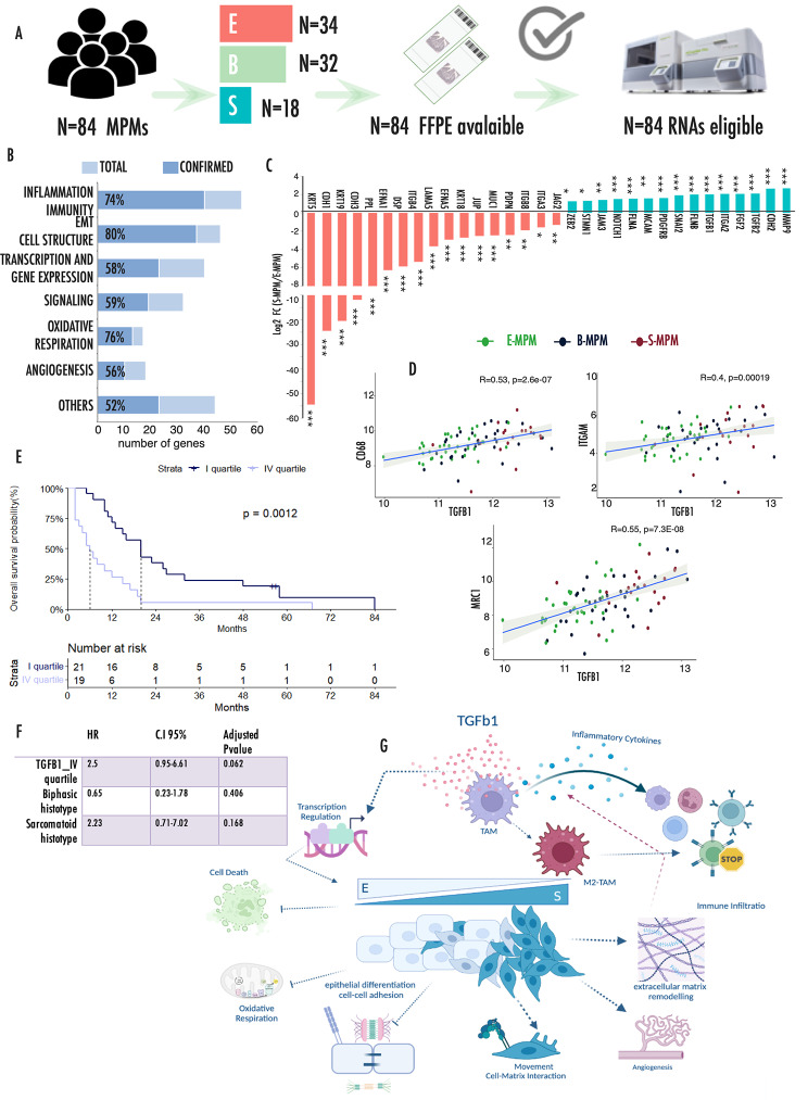
Fig. 5.
Validation analysis in an independent cohort of MPMs
(A) Pipeline of samples analysis by nCounter Nanostring technology. (B) Bar chart representing the number of deregulated genes involved in each functional category. Percentages represent the fraction of validated genes in each category. X-axes report the total number of genes included in the panel for each category as reported in Supplementary Table 8. (C) Histograms representing the relative expression of EMT associated genes in S-MPM samples as compared to E-MPMs. (D) Correlation plots showing the direct correlation of CD68, ITGAM and MRC1 with TGFB1 expression. Axes values refer to normalized counts. (E) Kaplan Meier curves representing the significantly different overall survival of patients with low (I quartile) and high (IV quartile) expression of TGFB1. In this figure p-values are represented as follow: *<0.05, **<0.01 ***<0.001. (F) Multivariate Cox analysis including TGFB1 expression quartile and histotype in the validation cohort. (G) Schematic representation model of the results emerged from the analysis

