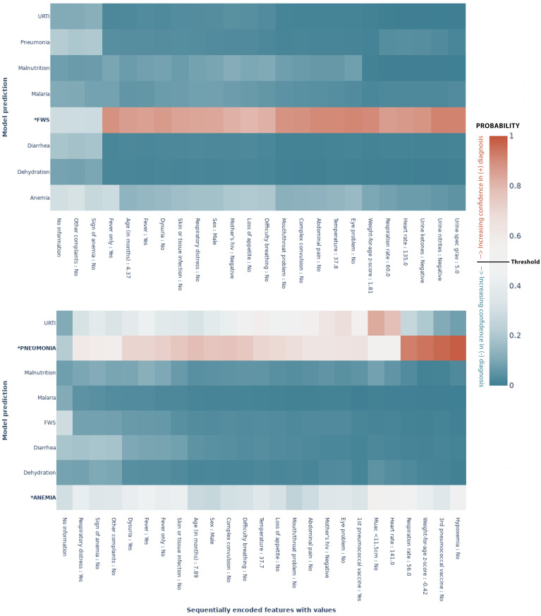
Fig 6. MoDN’s feature-wise predictive evolution in two random patients.
Each graph represents a single patient randomly selected from the test set. The y–axis lists the eight possible diagnoses predicted by our model. The true diagnosis of the patient is in bold and marked by an ‘*’. The x–axis is a sequential list of questions asked during the consultation (the response of that specific patient is also listed). In each case the model predicts the true label correctly. The heatmap represents a scale of predictive certainty from red (positive, has diagnosis) to blue (negative, does not have diagnosis), where white is uncertain. (a) Patient with the true diagnosis of pneumonia and anaemia. Here, predictive confidence accumulates slowly throughout the consultation. (b) Patient with a true diagnosis of FWS. Here, a confident prediction is achieved early after a highly determinant question of “fever only”. *: True diagnosis, URTI: Upper Respiratory Tract Infection, FWS: Fever Without Source, Threshold: probability at which the model categorises the patient with a diagnosis(50%).

