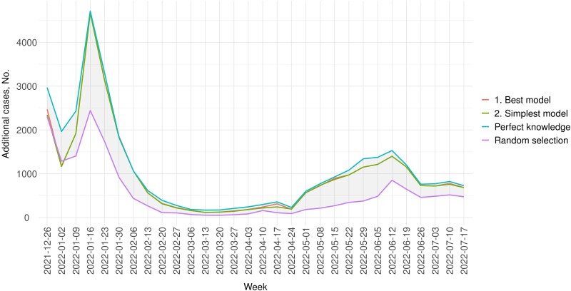
Figure 1.
Number of additional cases in a week under the counterfactual scenario where tests were increased by 1% in LA County compared with 2 weeks back, with all additional tests allocated to communities in the top 10% of predicted positivity. The blue line (the uppermost line) represents the number of additional cases if communities were ranked based on perfect knowledge of future test positivity, . While requiring knowledge of the future and thus not practicable, this line serves as the upper bound of the best possible prediction. The purple line represents the yields if communities were randomly selected and serves as the lower bound. The red and green lines represent the number of additional cases that could be detected if communities were selected based on the best and the simplest models, respectively. Test positivity was based on testing data from LA County Department of Public Health.

