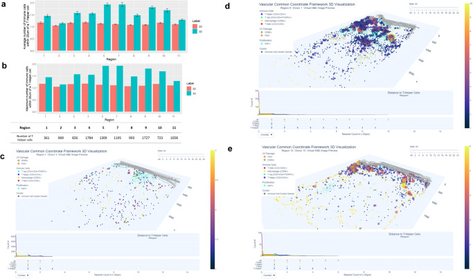
Fig. 4. Higher spatial density of T cells in 3D vs 2D and visualization of immune cell cluster density.
a Average number of all immune cells within 30 µm of a T helper cell in 2D (red) and 3D (blue) are shown for each donor sample. Overall, the number of immune cells within 30 um of a T helper cell was higher in 3D compared to 2D with 10–70% more cells found in 3D. Error bars represent the 95% confidence interval. Each error bar was derived from independent T helper cells detected in each region (n = 10 biologically independent samples). The number of T helper cells for each region is also shown; b Maximum number of immune cells within 30 µm of a T helper cell. There was variation across all regions, for example, in region 7 there a cluster of 11 immune cells within 30 µm were found in 3D while three cells were quantified in 2D. c Visualization of low immune cell cluster density in 3D. Immune cell cluster density plot is generated from region 1 (scalp region, marked sun exposure, male, 72 years of age). The size and color of the purple bubbles show that this sample has a relatively low number of neighboring immune cells in 3D. For interactive visualization of 3D and 2D sections go to: https://hubmapconsortium.github.io/vccf-visualization-release/html/immune_cluster/immune_cluster_region_1_30.htmld Visualization of medium-high immune cell cluster density in 3D. Medium-high immune cluster density plot from region 9 (lower distal arm region, marked sun exposure, male, 60 years of age). The increased number and size and colors (going from pink to yellow) of the bubbles sample show the higher number of neighboring immune cells in 3D. For interactive visualization of 3D and 2D section: https://hubmapconsortium.github.io/vccf-visualization-release/html/immune_cluster/immune_cluster_region_9_30.htmle Visualization of high immune cell cluster density in 3D. High immune cluster density plot from region 12 (biopsy was taken from the right flank but excluded from further analysis due to scarring; the donor also had systemic lupus erythematosus). The high number of orange and yellow bubbles shows a high number of neighboring immune cells in 3D (4–6+ cells with the highest density clusters, according to the color-coded legend) and demonstrates high immune cluster density. For interactive visualization go to: https://hubmapconsortium.github.io/vccf-visualization-release/html/immune_cluster/immune_cluster_region_12_30.html. All regions can be accessed at: Companion Website for “Human Digital Twin: 3D Atlas Reconstruction of Skin and Spatial Mapping of Immune Cell Density, Vascular Distance and Effects of Sun Exposure and Aging” | ㅤ (hubmapconsortium.github.io).

