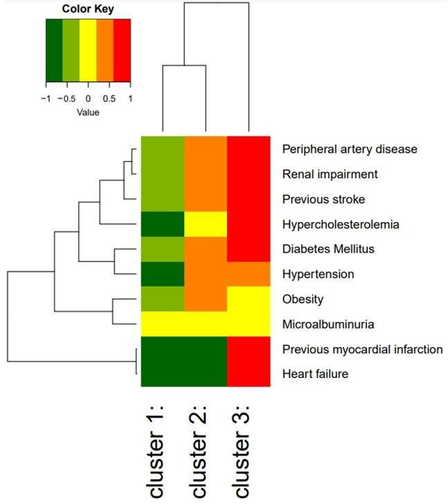
Figure 2.

Heat map of individual cardiovascular and renal comorbidities within each cluster the colours represent the log relative risk of the presence of the comorbidity compared with the average individual in this cohort. The branching diagrams represent the hierarchy of categories based on degree of similarity between the comorbidities (rows) or clusters (columns).
