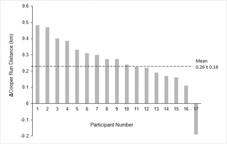
Fig 3. Waterfall plot.
The change in running distance response in the exercise group, post 8-weeks training. The black dashed line represents the average improvement post training in km. Each bar represents a single participant. Of the 21 participants, participants 6, 8, 12, and 14 were removed from this analysis because their genetic data was not internally consistent.

