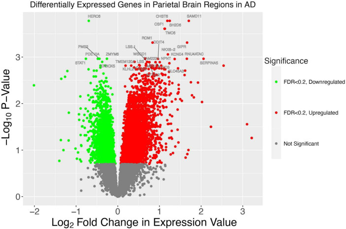
FIGURE 6.
A volcano plot illustrates patterns of gene dysregulation in AD. On the y-axis the –log10P-value calculated using DESeq2 is shown. On the x-axis, the log2 fold change in expression value is shown. Each dot represents a gene. A handful of the genes with the most extreme p-values are shown. Red dots lie to the right of the x = 0 asymptote and represent genes with a greater expression in AD. Green dots lie to the left of the x = 0 asymptote and represent genes which have decreased expression in AD. All dots below the line of –log10(0.2) are colored gray and represent genes which have a statistically insignificant change between conditions.

