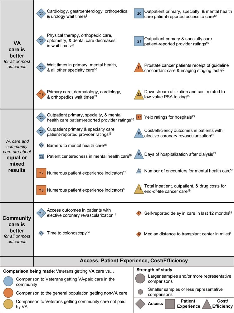
Figure 3.
Evidence map of VA vs. non-VA access, patient experience, and cost/efficiency. Notes: Studies are listed by domains of care of the outcomes they report by shape: diamonds for access; squares for patient experience; and triangles for cost/efficiency. Studies are also listed on the vertical axis by their qualitative results (VA care is better than community care, VA care and community care are about equal, or results are mixed, and community care is better than VA care). Study quality is depicted by bubble size, with larger bubbles being studies of better quality and representativeness than studies depicted by smaller circles. The color of the bubble indicates the type of comparison: blue for studies comparing Veterans getting care from VA to Veterans getting VA-paid care in the community; orange for studies comparing Veterans getting care from VA and non-Veterans, or a general population, getting care in the community; and, yellow for studies comparing Veterans getting care from VA to Veterans getting care in the community not paid for by VA. Beside each circle is a brief annotation of the study topic, and inside the bubble is the year of publication (’18 = 2018,’19 = 2019, etc.).

