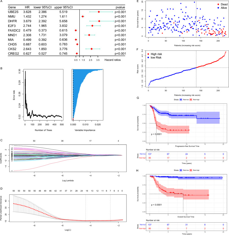
Figure 5.
Construction of the risk model. (A) The forest plot showed the HR and 95% confidence interval of the most significant TOP 10 genes in the univariate regression results, sorted by P value. (B) The left graph showed the variation of Error rate with the number of trees. The right graph showed the ranking of genes according to the importance of the VIMP algorithm, where blue represents favorable to the correct judgment of the endings and red represents unfavorable. (C) Each line in the above graph represented a gene, the vertical coordinate was the value of the coefficient, the lower horizontal coordinate was log(λ), and the upper horizontal coordinate was the number of non-zero coefficients in the model at this time. (D) Based on cross-validation, for each value of λ, around the mean value of the target covariate shown in red, we can obtain a confidence interval for the target covariate. The two dashed lines indicate each of the two particular λ values. We chose lambda.1se as the final model parameter. (E) Each point in the scatter plot represented the survival status and survival time of a patient. The horizontal coordinates were the patients ranked from lowest to highest according to their risk scores. (F) Based on the risk score of each point in the scatter plot representing one patient, we divided them into high-risk and low-risk groups. (G,H) The Kaplan–Meier curves showed the progression-free survival time (G) and OS time (H) of the two risk groups of patients inside the E-MTAB-8248 dataset.

