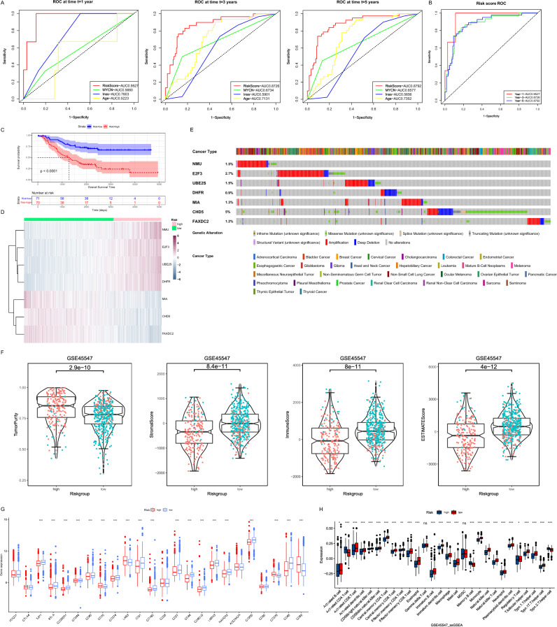
Figure 6.
Validation and investigation of risk models. (A) The ability of clinical indicators and risk scores to determine prognosis at year 1, year 3, and year 5 were compared using ROC curves. (B) The ROC curve demonstrates the ability of the risk score to determine prognosis at year 1, year 3, and year 5. (C) The Kaplan–Meier curves showed the OS time of the two risk groups of patients inside the TARGET dataset. (D) The heat map demonstrated the expression levels of seven risk model genes in patients. (E) Mutations of 7 risk model genes in multiple tumors. (F) Comparison of differences in ESTIMATES results between high and low risk groups. Red dots indicated that patients belong to Cluster 1 and green dots indicated that patients belong to Cluster 2. (G) Box plots showed the mRNA expression of immune checkpoints in two risk groups (*P < 0.05; **P < 0.01; ***P < 0.001). (H) Box plot of the distribution of immune cell expression between the two risk groups as calculated by the ssGSEA algorithm (*P < 0.05; **P < 0.01; ***P < 0.001).

