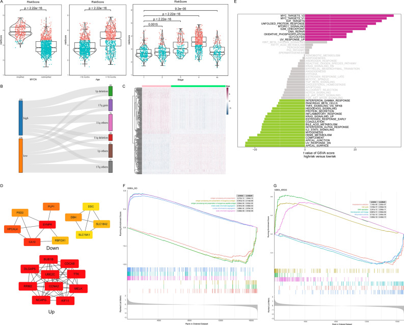
Figure 7.
Comparison between high and low risk groups. (A) Comparison of risk scores in MYCN status, age groups and INSS stages. (B) The Sankey diagram showed the distribution of chromosomal abnormalities in the two risk groups. (C) The heat map showed the levels of differential genes between the high and low risk groups. (D) TOP 10 hub genes identified by MCC algorithm. (E) The bar graph showed the results of GSVA enrichment. Purple represented the major pathways enriched to in the high-risk group and green represented the major pathways in the low-risk group. (F) The TOP 3 most significant GO enriched terms in the high-risk and low-risk groups. (G) The TOP 3 most significant KEGG enriched pathways in the high-risk and low-risk groups.

