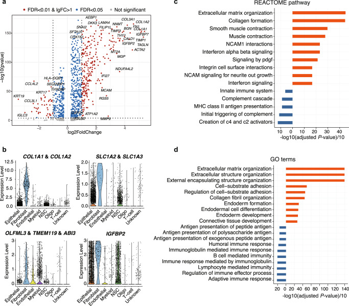
Fig. 3. Characterization of tumor-associated fibroblasts.
a The volcano plot shows the differentially expressed genes (DEGs) between fibroblasts versus the rest of cells. The x-axis represents the log2 (fold change) of the DEGs and the y-axis represents the adjusted P-value (−1 × log10 scale). Blue dots represent genes with adjusted P-value < 0.05. Red dots represent the genes with adjusted P-value < 0.01 and |log2 FC|>1. b Violin plots show the expressions of functional genes that are abundant in fibroblasts. c Significantly enriched REACTOME pathways of the DEGs of fibroblasts are shown in bar plots. The x-axis represents -log10(adj. P)/10, which is calculated by the gene set enrichment test. d Significantly enriched GO terms of the DEGs of fibroblasts are shown in bar plots. The x-axis represents -log10(adj. P)/10, which is calculated by the gene set enrichment test.

