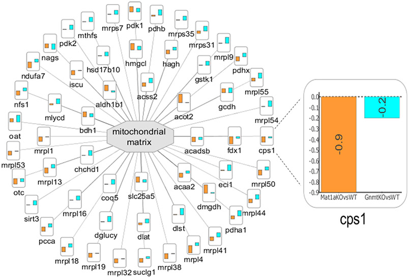
Figure 5.
Enriched cellular subnetwork for mitochondrial matrix generated by PINE across different NASH models. Altered cellular components are denoted by central gray nodes. Differential expression data from multiple comparison groups are represented as bar charts and the bar height indicates degree of fold change. (Example: Zoomed view into node CPS1 indicates degree of fold change for Mat1a −/− mice vs WT littermates shown using orange bar and Gnmt −/− mice vs WT littermates shown using blue bar.)

