
Figure 2.
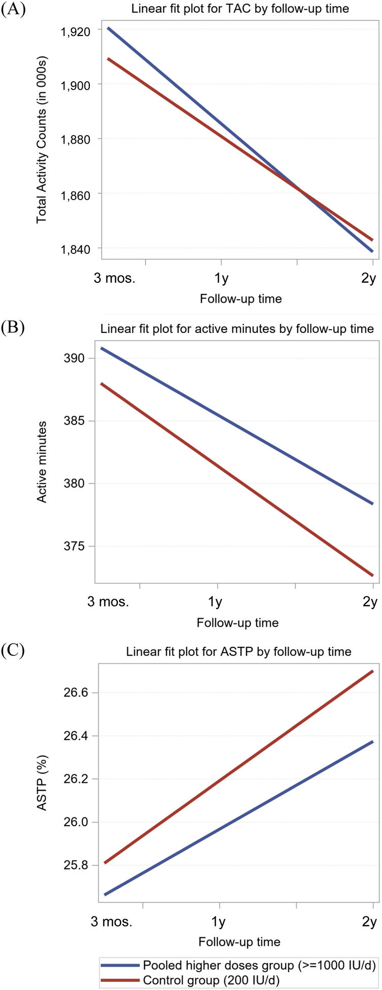
Fitted plots for linear mixed effects models comparing decline in physical activity measures over follow-up in the pooled higher doses group (≥1000 IU/d, blue line) to the control group (200 IU/d, red line). Panel (A): Total Activity Counts (TAC, in 000s), Panel (B): Active Time (minutes per day), Panel (C): Active to Sedentary Transition Probability (ASTP, %).