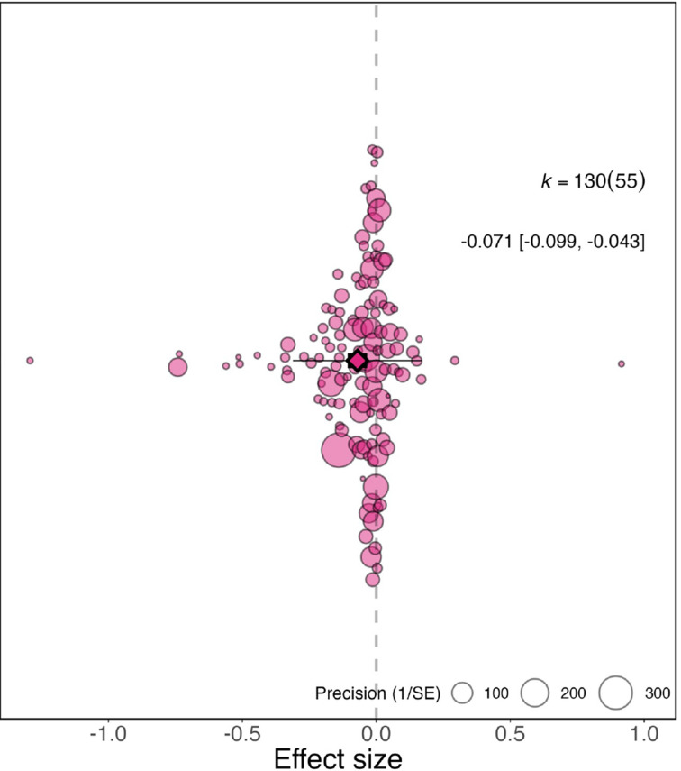
Figure 1. Overall effect of the pandemic on the gender gap in research productivity.
Orchard plot showing all 130 effect sizes (points), and the precision with which they were measured (point size). The plot shows the mean effect size (darker coloured point outlined in black and vertically centred), the 95% confidence interval (horizontal thick black bar), the 95% prediction interval of the expected spread of effect sizes based on between-study variance (horizontal thin black bar) and is centred at 0 (vertical dashed line). Points are spread vertically for presentation reasons to reduce overlap. k is the total number of effect sizes; the 130 effect sizes shown here were calculated from 55 studies.

