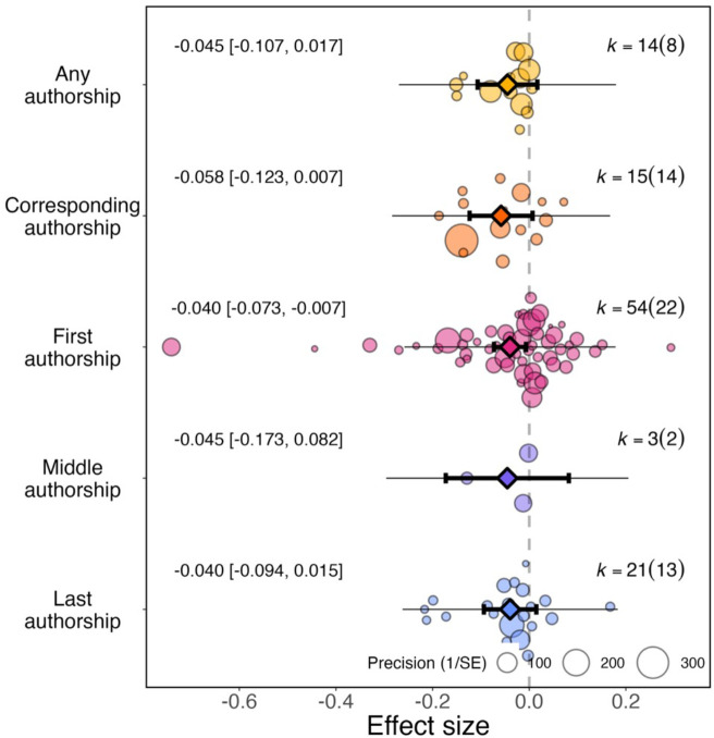
Figure 5. Effect of the pandemic on the gender gap in research productivity (as measured by number of articles submitted or published) for five authorship positions.
Orchard plots comparing the distribution of effect sizes (points) and the precision with which they were measured (point sizes), for various authorship positions. Each plot shows the mean effect size (darker coloured points outlined in black and vertically centred), the 95% confidence interval (horizontal thick black bar), the 95% prediction interval of the expected spread of effect sizes based on between-study variance (horizontal thin black bar) and is centred at 0 (vertical dashed line). Within each category, points are spread vertically for presentation reasons to reduce overlap. For each subgroup, k is the total number of effect sizes, and the number of studies from which these effect sizes were calculated is given inside the brackets.

