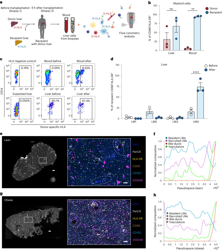
Fig. 3. Human LM cells are mostly monocyte-derived.
a, Experimental outline: liver biopsies and peripheral blood samples were collected before and 6 h after liver transplantation (n = 3 per group). Liver cells and PBMCs were then isolated and used for flow cytometric analysis to assess the proportion of recipient-derived and donor-derived cells. D-HLA, donor HLA; R-HLA, recipient HLA. b, Proportion of donor-derived or recipient-derived macrophages among all living CD45+CD68+HLA-DR+ myeloid cells after transplantation (n = 3 per group; blood donor versus recipient, P = 0.0024). c, Representative analysis of proportion of donor-derived cells as assessed by flow cytometric staining for donor-specific HLA. d, Proportion of LM subsets among all living CD45+CD68+HLA-DR+ myeloid cells in livers before (recipient, n = 3) and after (donor, n = 3) transplantation (LM4 before versus after, P < 0.0001). LM1 was defined as CD14+CD16+CD206+S100A9−, LM2 as CD14+CD16−CD206+S100A9−, LM3 as CD14+CD16+CD206−S100A9+ and LM4 as CD14+CD16−CD206−S100A9+. e, Representative images of lean human livers imaged using PhenoCycler, displaying the imaged tissue (left) and region of interest highlighting six markers (right; DAPI, PanCK, HLA-DR, CD68, CD163 and S100A9) that are colored according to the panel on the right. Regions containing portal tracts (pt) and central vein (cv) are highlighted in the image by dashed white lines. Images are representative of two individuals. Scale bar, 400 µm (left; entire tissue) and 100 µm (right; region of interest). f, Pseudospace plot visualizing the composition of resident and recruited myeloid cells sorted by tissue regions containing bile ducts (sorted to the right) in one lean donor. g, Representative images of livers of humans with obesity imaged using PhenoCycler. Images are representative of two individuals. Scale bar, 400 µm (left; entire tissue) and 100 µm (right; region of interest). h, Corresponding pseudospace plot. Data are presented as mean ± s.e.m. P values were calculated by two-way ANOVA with adjustment for multiple comparisons. **P < 0.01; ****P < 0.0001. Illustrations in a were partly created using components adapted from Servier Medical Art, provided by Servier, licensed under a Creative Commons Attribution 3.0 unported license.

