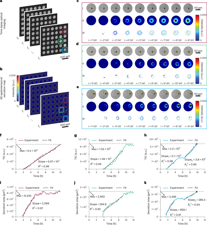
Fig. 2. 4D spatiotemporal secretion map allows for the identification of distinct secretion profiles in hybridoma cells.
a, Time-lapse optical images of the single-cell microwell array are used to track the cells’ positions and monitor their morphological changes using a machine-learning random forest algorithm. b, 4D spatiotemporal secretion maps of the cells in the microwell array over time. The map shows variations in the intensity of the camera pixels due to the spectral redshifts originating from IgGs binding on the sensor surface. c–e, Three representative secretion profiles for the hybridoma cells along with their corresponding optical images show a gradual increase in both intensity and area covered by the secretion over selected time points. I, bright-field optical images; II, spatiotemporal secretion maps; III, secretion contour plots. In the optical images, the cell boundary is displayed by the yellow lines around the cell, using the cell tracking algorithm in the machine-learning protocol. f–h, TIC curves indicating the amount of IgGs secreted over time for the cells shown in c,d and e, respectively. Linear curve fitting is used to extract the secretion rate (the slope), and the maximum amounts of secretions (Max) are denoted by the grey dashed lines. f shows a linear increase in secretion during 12 h (type I), while the secretion in g reaches a plateau after some hours and forms a half sigmoid (type II). h is a combination of these two secretion profiles as it shows another rise after the plateau (type III). i–k, Secretion area curves presenting the area occupied by the adsorbed IgGs on the sensor surface over time for the cells shown in c,d and e, respectively. The adsorption rates (indicated by the slope) and the maximum secretion areas (given by Max) are calculated in a similar way as the TIC curves. The × sign on the curves refers to the onset of apoptosis.

