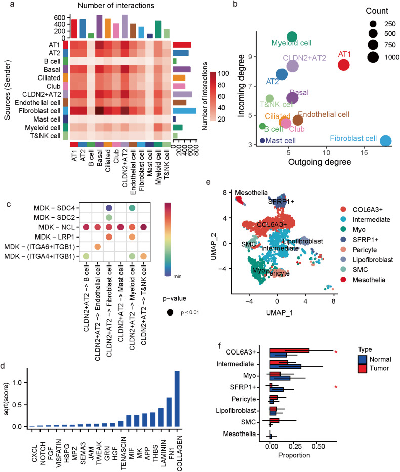
Fig. 4. Cell–cell interactions in MPLCs.
a Heatmap of the cell–cell interactions between different cell types. The row and column, respectively, stand for the source and target cell types of the interactions. The top and right colored bar plot respectively represent the sum of column and row of values displayed in the heatmap. b Scatter plot of the interaction strength of different cell types. c Bubble plot of the interactions originated from the CLDN2+ AT2 cells and mediated by MDK. d Bar plot of the summarized communication probabilities on signaling pathways based on the interactions from fibroblast cells to CLDN2+ AT2 cells. e UMAP plot of the subpopulations of fibroblast cells. Myo: myofibroblast, SMC: smooth muscle cells. f Bar plot of the average proportions of each fibroblast cell sub-population in tumor and tumor-adjacent tissues. Data represent mean ± s.d. *P < 0.05, t test, unpaired.

