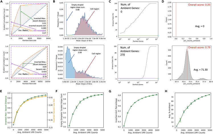
Figure 1.
Ambient contamination metrics robustly reflect data quality on simulated datasets
(A) Scaled cumulative total transcript counts over ranked barcodes by total transcript counts for datasets simulated with (top) low ambient level and (bottom) high ambient level. Secant lines from the curve to the diagonal line are colored in gray with the line with maximal secant line colored in green, which were used to calculate inverted maximal secant distance and secant line standard deviation. The area under curve (colored in orange) and the minimal rectangle circumscribing (dashed purple line) were used to calculate the inverted AUC percentage.
(B) Scaled representation of the slope distribution histograms shown in Figures S1I and S1J for (top) low and (bottom) high ambient datasets shown in A. The x axis values are midpoint of each bin in the slope distribution histogram, and the y axis values are multiplication product of the bin midpoint values and the bin heights. The region representing slopes that were below the threshold were considered as empty droplets and were colored in blue. The sum of these datapoints is quantified as empty droplets' scaled slope sum.
(C) Distribution of dropout rate of genes ranked by ascending dropout rate for datasets simulated with (top) low and (bottom) high ambient level. The pink line is drawn at 2% dropout rate, the cut-off below which a gene will be defined as ambient.
(D) Distribution of percentage of ambient genes expressed per cell for dataset simulated with (top) low and (bottom) high ambient level. The mean percentage is quantified. The AmbiQuant overall score is labeled in red.
(E–H) (E) Maximal secant distance (green) and secant line standard deviation (yellow), (F) AUC percentage, (G) cell’s scaled slope sum, and (H) percent counts ambient over different ambient levels for simulations. Line plots shown as mean ± stdev of n = 1000 replicates for each ambient level.

