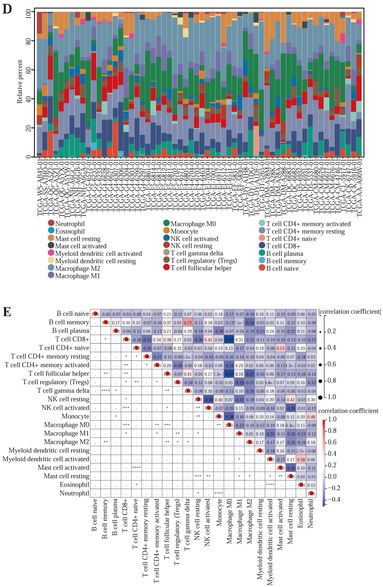
Figure 5.
(A, B, C) GSEA enrichment analysis of CDKN2A, MMP3, and SERPINE1, respectively. (D) Histogram of the multifarious immune cell contents in the TCGA database. (E) Graph of correlations between the levels of multifarious immune cells. (F, G, H) A linear regression graph of various immune cell levels and prognostic gene expression. (I, J, K) Linear regression plots of immune infiltration scores and prognostic gene expression relationships in different samples. (L, M, N) The map of the linear regression between expression levels of multifarious immune checkpoints and prognostic gene expression. (O, P) Survival plots of stromal cells versus immune cells in the samples.


