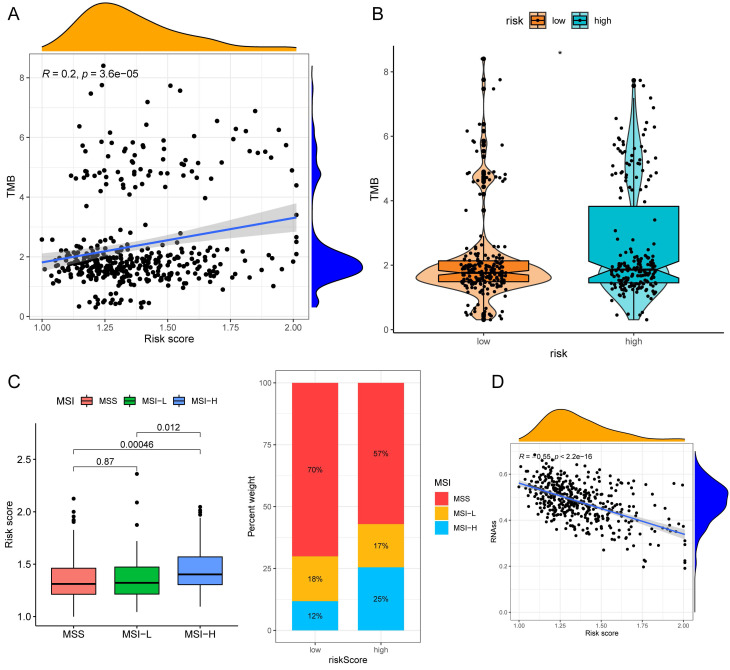
Figure 10.
TMB and MSI analysis of the low- and high-risk groups. (A)Correlation scatter graph of TMB and Risk score. (B) The box-violin plot displaying the difference of the TMB score in two groups. (C) The risk scores in patients with different MSI statuses and the percentages of different MSI statuses in different risk score groups. (D) The correlation scatter plot between risk score and RNAss. *P < 0.05; **P < 0.01; ***P < 0.001.

