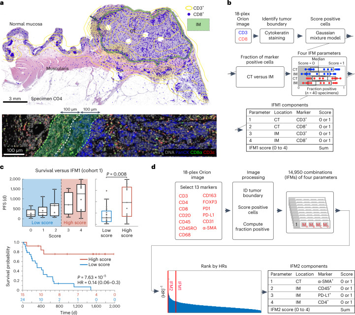
Fig. 4. Recapitulating the Immunoscore tissue immune test using Orion images.
a, Map of CT and IM compartments overlaid on an H&E image with the density of CD3+ cells shown as a contour map and the positions of CD8+ T cells shown as dots. The arrow indicates the zoom-in image shown below. Bottom, selected channels from a portion of the Orion image spanning the invasive boundary (denoted by shaded overlay). Images were from one representative specimen/section (C04). b, Flow chart for the calculation of IFM1 that recapitulates key features of the Immunoscore test. c, Top, box-and-whisker plots for PFS for 40 individuals with CRC based on actual IFM1 scores where the midline indicates the median, box limits indicate quartile 1 (25th percentile)/quartile 3 (75th percentile), whiskers indicate 1.5× IQR, and dots indicate outliers (>1.5× IQR). Scores are stratified into two classes as follows: low, score of ≤2; high, score of 3 or 4 (pairwise two-tailed t-test P = 0.002). Bottom, Kaplan–Meier plots computed using IFM1 binary classes (HR, 95% CI and log-rank P value). d, Flow chart for calculation of additional models that use the underlying logic of Immunoscore but considering 13 markers. The image processing steps are the same as in a. The rank positions of IFM1 and IFM2 are shown relative to all other 14,950 combinations of parameters that were considered.

