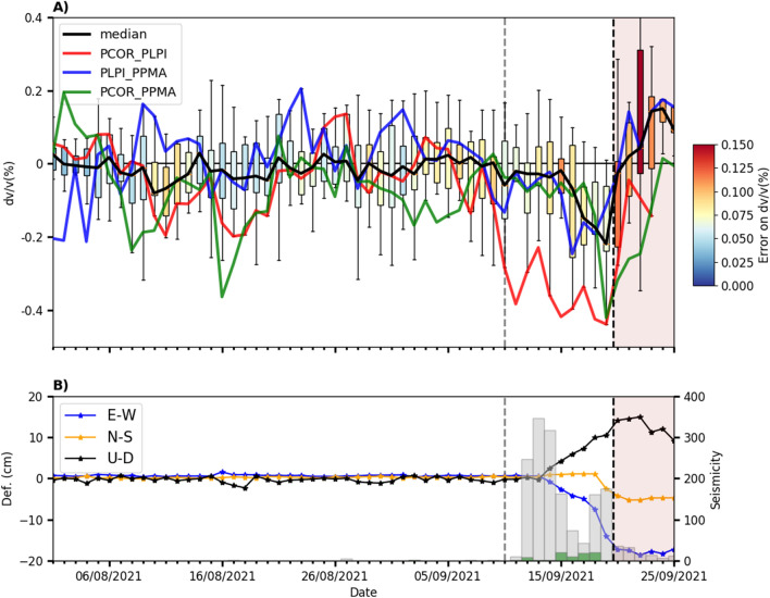
Figure 2.
Comparison of daily with the seismicity and deformation produced during the pre-eruptive and eruptive periods (vertical black dashed line showing the eruption onset). The vertical gray dashed line represents Sept. 10th. (A) Statistical analysis of daily for all the station pairs (median, black line), together with some for specific station pairs (PCOR_PLPI: red line, PLPI_PPMA: blue line, PCOR_PPMA: green line). Each boxplot represents the minimum and maximum values of (lower and upper horizontal lines), its lower and upper quartiles (lower and upper box limits), and its median. The color of the boxplots represents the estimated error on . (B) Time series of GPS ARID deformation appear as blue, orange and black lines for the E-W, N-S and U-D components, respectively. The histogram bars indicate the seismicity possibly related to the fluid injection (green dots) and magmatic intrusion (black dots). The relative velocity variation curves were obtained using MSNoise software19 (http://www.msnoise.org).

