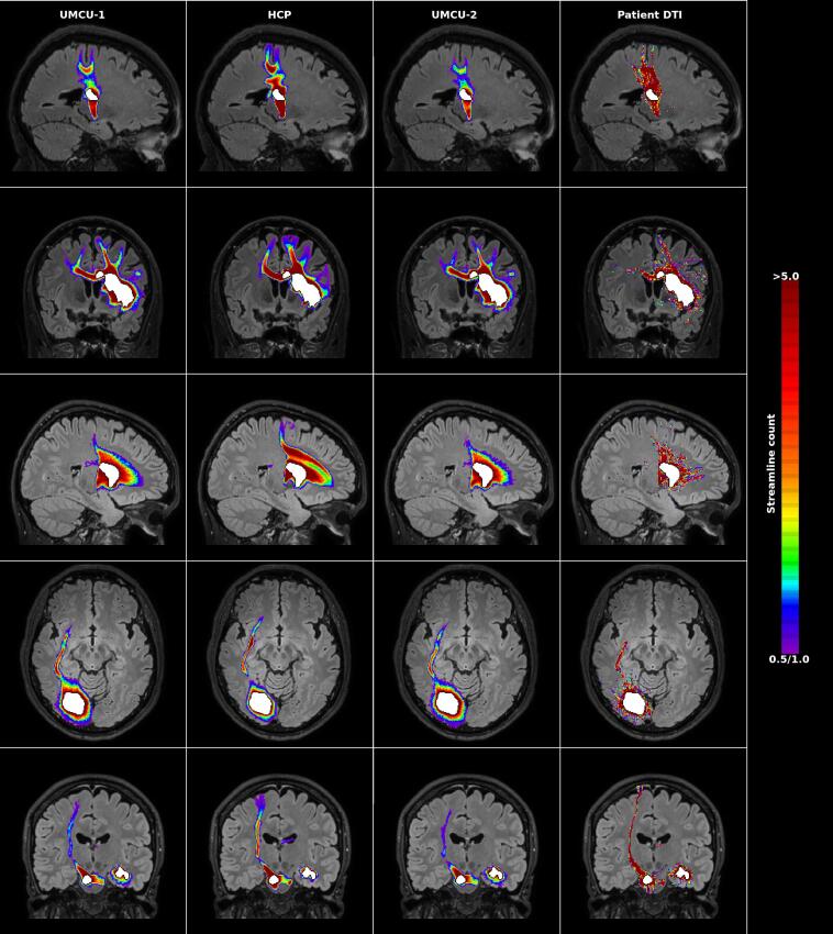
Fig. 2.
Examples of predictions of white matter damage following stroke. The left three columns depict the predictions by the three databases, where the density of damaged streamlines (count ≥ 0.5) is superimposed on the normalized FLAIR image of the individual patient. The right column shows the fiber-counts of streamlines touching the lesion, or starting in the perilesional area according to the diffusion data of the patients (count ≥ 1). Each row provides the results for a different patient. The segmented lesion is shown in white. For each patient the most informative slice is shown (i.e. the slice including on average the maximum extent of the prediction). Images are displayed according to the neurological convention.

