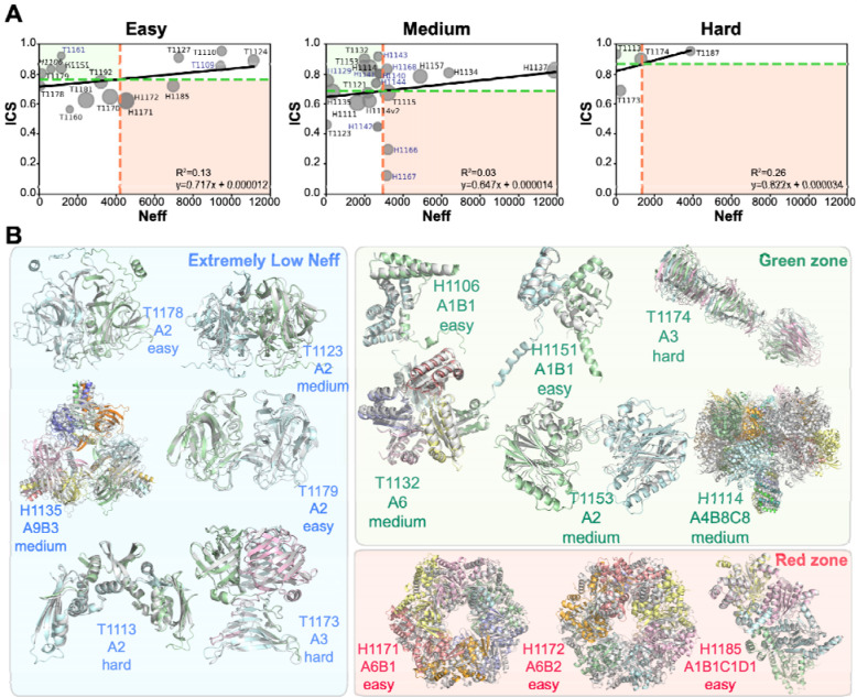
Figure 4.
A. Relationship between baseline Neff values and the best ICS values for each difficulty category. In all categories, the horizontal green dotted line represents the mean best-ICS value, and the vertical red dotted line represents the mean Neff value. The green zone represents areas where lower Neff values are associated with higher ICS values, while the red zone represents areas where higher Neff values are associated with lower ICS values. The special cases (11 targets) are shown in purple. Markers of data points are scaled to their assembly size with larger complexes shown as larger circles. B. Comparison of the best ICS models with the experimental structures. The best ICS models (shown in color) superimposed on target structures (gray) for the green, red, and extremely low Neff zone targets (see panel A). Stoichiometry and difficulty definitions are provided for each target.

