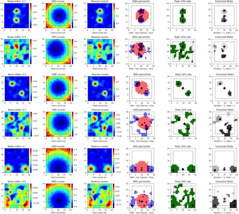
Figure 5. Dual field localization.
Field localization plots across two different noise levels (rows: low noise 0.1 and high noise 0.5). For each row in a plot, the first column shows the ratemap post added noise with padding, smoothing and normalizing. The second column shows the EMD distribution on the padded rate map with scores being relative to a fake point map with all the density placed in the bin at which the EMD score is found. The third column shows the same map to point computation for Pearson’s r scores. The fourth column shows the 80th percentile scores for the EMD (red) and Pearson’s r distributions (blue). The fifth column shows the top 20% firing rates in the cell. The last column (sixth) holds the extracted blobs (fields) from the padded ratemap with the centroid of each blob shown in red. The circle represents the true field centroid. The star represents the centroid computed on the peak EMD scores. The triangle is the centroid computed from the peak Pearson’s r scores. The diamond is the centroid from the peak firing rates. The red dots are the centroids of a given field

