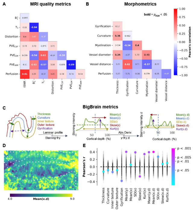
Figure 4.

Between-feature correlations. (A-B) Heatmaps depicting the correlations between different features (see Supplementary Figs. 2 and 3) on their vertex-wise averages, with corresponding Pearson’s correlation coefficients annotated. Significant correlations, after correcting for spatial autocorrelation and multiple comparisons, are indicated by bold annotations. Panels (C-E) illustrate the correlations between perfusion and various hippocampal morphometric and cell density measures derived from BigBrain. In panel (E), the point plot displays permuted Pearson’s correlation coefficients represented by semi-transparent black markers, which were used to calculate color-coded significance levels.
