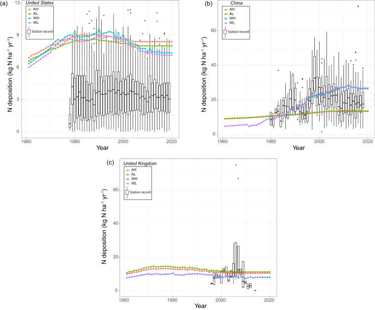
Fig. 8.
Comparison of station measurements with the N deposition maps aggregation for (a) United States, (b) China, and (c) United Kingdom. Each colored dot represents estimate for each year from different deposition and cropland maps. Boxplot represents distribution of N deposition from stations considered for comparison. These boxplots only represent wet N deposition due to unavailability of dry deposition from these networks; hence, for some years the ground station values are systematically lower than our product estimates. The acronyms in legends are AH: ACCMIP + HYDE; AL: ACCMIP + LUH2; WH: Wang et al. + HYDE; and WL: Wang et al. + LUH2.

