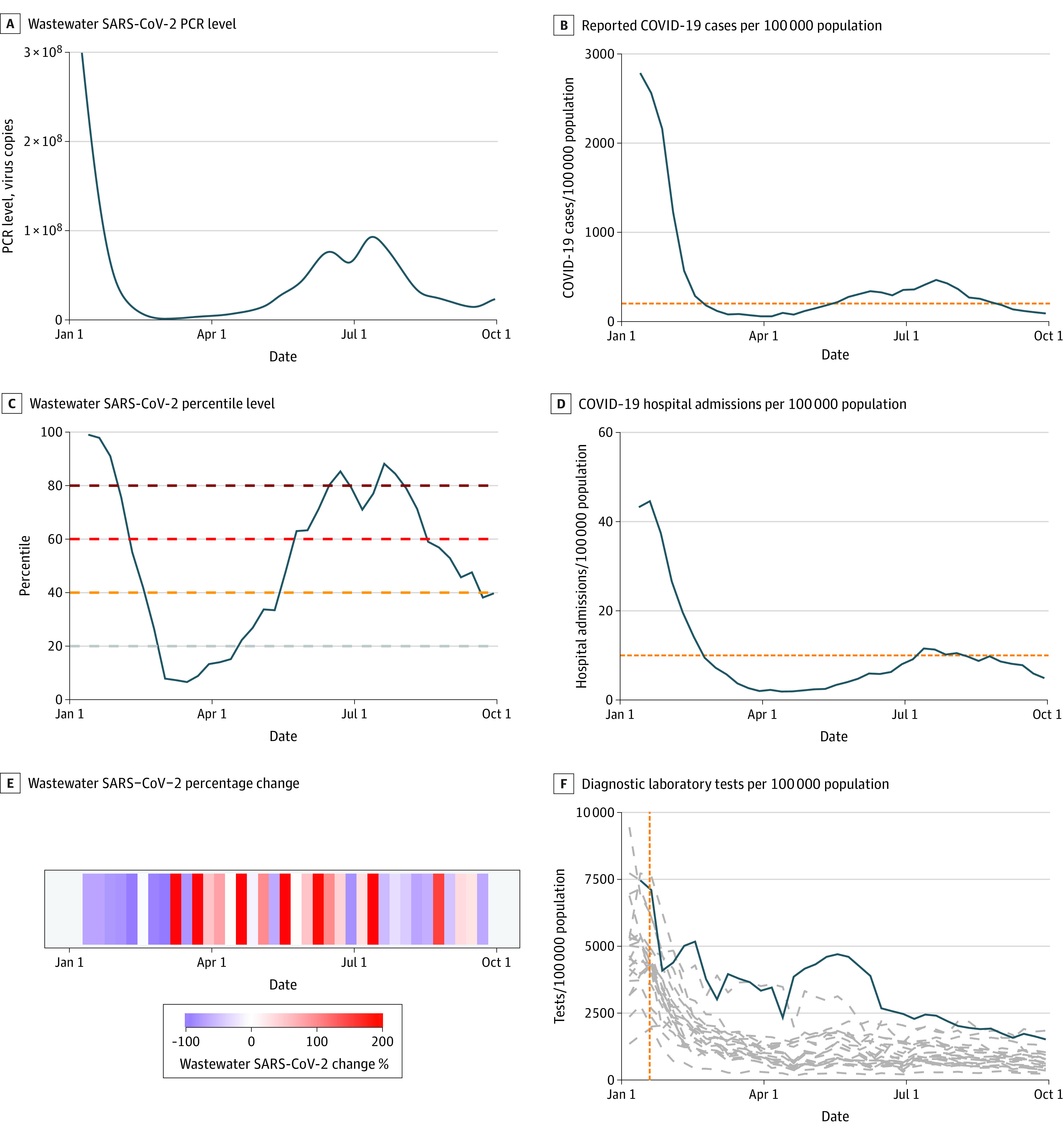
Figure 2. Time History of Wastewater Surveillance Data and Clinical Case Metrics From Los Angeles County, California, January 2022 and September 2022.

A, Graph shows smoothed spline-fit polymerase chain reaction (PCR) concentrations of SARS-CoV-2 for each sampling location as reported by the Centers for Disease Control and Prevention National Wastewater Surveillance System. B, Graph shows reported COVID-19 cases per 100 000 population. C, Graph shows wastewater SARS-CoV-2 percentile level. D, Graph shows COVID-19 hospital admissions per 100 000 population. Horizontal dashed lines in B and D show thresholds for high COVID-19 community level (reported COVID-19 case rate ≥200 per 100 000 population and reported hospitalization rate ≥10 new inpatient admissions per 100 000 population, respectively). E, Graph shows wastewater SARS-CoV-2 15-day percentage change. F, Graph shows state-level data for diagnostic laboratory tests per 100 000 population (solid black line shows reported tests from the state of California; dashed gray blue show estimates for all other US states; dashed vertical orange line represents the date when distribution of rapid home tests was announced by the Biden administration, January 19, 2022). The solid blue lines in panels A, B, C, D, and F show weighted mean values using each sewershed’s population served. Data for the most populous counties in US Census regions Midwest and Northeast are shown in eFigure 4 in Supplement 1.
