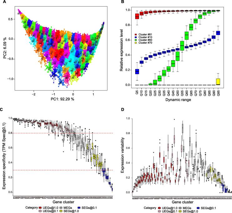
Figure 5.
Global expression specificity categories
A. PCA plot visualizing the global expression patterns and clustering results. Each dot represents a gene. Different colors represent 96 gene clusters. The genes within the same cluster show similar expression levels, expression specificity, and expression variability. B. Boxplot showing the global expression patterns of some gene clusters. C. Boxplot showing the distribution of expression specificity of 96 clusters. The clusters (boxes) are ranked according to their median skewness. The red dashed lines represent the global expression specificity (ϕ) of 0.8 (upper) and 0.3 (lower), respectively, using the detection threshold of TPM ≥ 0.1. D. Boxplot showing the distribution of expression variability among these clusters. The clusters (boxes) are ranked according to their median skewness. PCA, principal component analysis.

