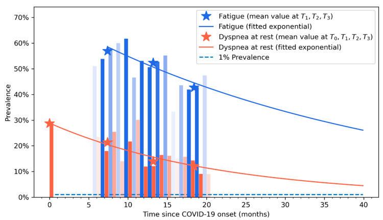
Figure 3.
Exponential recovery curve of self-reported fatigue (in blue) and dyspnoea (in orange) symptoms. Vertical bars represent the percentage of patients that self-reported fatigue (in blue) or dyspnoea (light red) at each follow-up period. Asterisks represents the prevalence point of each symptom at each follow-up (T0, T1, T2, and T3).

