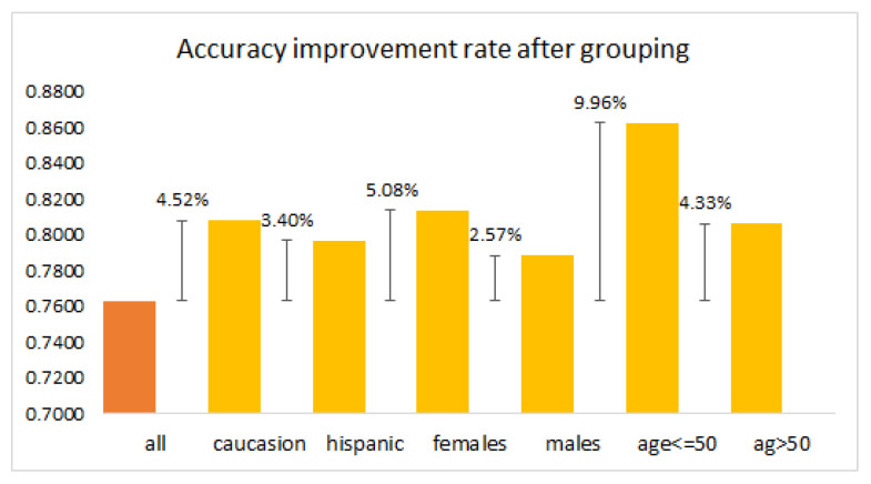
Figure 9.
Bar chart of accuracy percentage change after grouping based on age, gender, and race. The figure compares the accuracy of the model when using the entire dataset (all) to the accuracy after grouping based on age, gender, and race. Positive values denote an increase in accuracy, thus showcasing the effectiveness of grouping based on these demographic factors.

