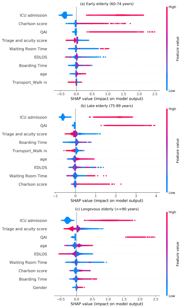
Figure 6.
SHAP visualization for top nine features of the IHM (in-hospital mortality) in three age groups. The higher the SHAP value of a feature, the higher its impact on the risk of IHM. Each dot represents a patient. Dots are colored by the feature value for that person and piled up vertically to show density. Particularly, for binary variables (i.e., {0,1}), the red dot represents a value of 1, and the blue represents a value of 0. QAI, quality assurance issue; EDLOS, emergency department length of stay; Charlson score, Charlson Comorbidity Index.

