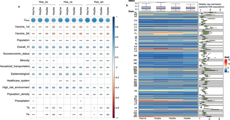
Fig. 3. Correlation between explanatory factors and hospitalization records and performance of WBE-based batch model for predicting future weekly new hospital admissions.
a Spearman’s correlation between all the explanatory factors and hospital admission records (three types of hospitalization indicators (i.e. Hos_wn: weekly new admission, Hos_cs: census inpatient sum, and Hos_ca: census inpatient average) under 4 leading times (Hos1w, Hos2w, Hos3w, Hos4w: the upcoming week, the second, third and fourth week after the wastewater sampling, respectively). The color and circle size indicate the strength of the correlation (bigger circle = stronger correlation; blue color = positive correlation and red color = negative correlation). The significance of the correlation is determined through two-side t-test, and marked as *, **, and *** representing a p value of ≥0.01 and <0.05, ≥0.001 and <0.01 and <0.001, respectively. The detailed p values are provided in Table S6. b The mean absolute error (MAE) of the established batch model for predicting weekly new hospital admissions in these 99 counties from June 2022 to January 2023. The main heatmap shows the MAE (reflected by the color) between the prediction and the actual admission record for each county. The box plot on the right shows the weekly new admissions (patients/ 100k population) for each county during June 2022–January 2023. The colored box indicates the 25th and 75th percentiles, and the whiskers indicate the 1.5× the interquartile range. The line in the box indicates median and dots represent outliers. N = 31 for each county. The top box plot summarizes the normalized MAE (NMAE) for the prediction at different leading times (Hos1w, Hos2w, Hos3w, and Hos4w). The NMAE is calculated as the MAE divided by the mean of weekly new admission numbers (see methods for equations). The colored box indicates the 25th and 75th percentiles, and the whiskers indicate the 1.5× the interquartile range. The line in the box indicates median and dots represents outliers. N = 99 for each prediction leading time (Hos1w-Hos4w).

