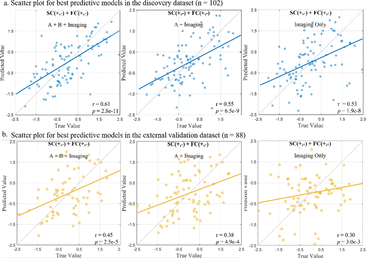
Fig. 4. Scatter plot for best predictive models in the discovery and the external validation dataset.

The accomplished robust prediction of global T-score using connectome-based prediction modeling in the sample of 102 PLWH (a), and the identified neuromarkers were generalized to validation cohort (n = 88) (b). Each dot in the scatter plot, represents a single participant from the dataset and their measured global T-scores score and predicted score.The dashed diagonal line represents a perfect 1-to-1 linear relationship between measured and predicted values. Values in the x-axis and y-axis were standardized to z-scores for visualization.
