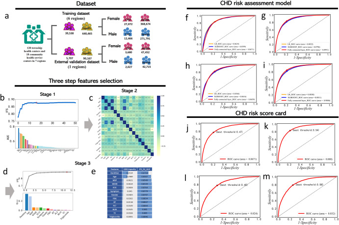
Fig. 1. The flow chart to show the benchmark data, feature selection, and prediction performance of CHD risk assessment.
a gender-specific training dataset and external dataset based on physical examination data. Among them, purple indicates patients with CHD regardless of gender, and yellow indicates healthy people regardless of gender. The pink shows the female population and the blue shows the male population. The three-step feature screening scheme is as follows: b Stage 1 is an IFS curve (blue curve) generated based on the AUC sorting of a single feature. The red dot of the blue curve represents the maximum AUC. The different colors of the bar plot represent different features in the feature subset, and the height of the bar plot represents the AUC value of a single feature. c Stage 2 is a heat map used to show Pearson correlations between pairwise features. d Stage 3 refers to the IFS curve (gray curve) generated after feature sorting based on the Gini coefficient. Red points on the gray curve represent the maximum value of AUC. Different colors of the histogram represent different features, and the height of the histogram represents the Gini coefficient value of a single feature. e The Gini impurity of each feature in Stage 3 and the AUC values of feature subsets generated by IFS strategy. f The ROC curves of CHD risk assessment model on male training cohort. g The ROC curves of CHD risk assessment model on female training cohort. h The ROC curves of the CHD risk assessment model on external validation cohort of males. i The ROC curves of the CHD risk assessment model on an external validation cohort of females. j The ROC curves of CHD risk scorecard on training cohort of males. k The ROC curves of CHD risk scorecard on training cohort of females. l The ROC curves of CHD risk scorecard on external validation cohort of males. m The ROC curves of CHD risk scorecard on external validation cohort of females.

