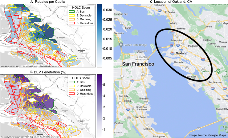
Figure 3.
BEV penetration and rebates per capita in formerly redlined neighborhoods in Oakland, California
(A) Cumulative rebates per capita awarded in neighborhoods in Oakland, California. Darker blue indicates higher rebates per capita. The color of the outlines corresponds to the HOLC score in the neighborhood, with green corresponding to an “A” grade, yellow corresponding to a “B” grade, orange to a “C” grade, and red to a “D” grade. (B) BEV penetration in 2020 in neighborhoods in Oakland, California. Darker purple indicates higher BEV penetration. The color of the outlines corresponds to the HOLC score in the neighborhood, with green corresponding to an “A” grade, yellow corresponding to a “B” grade, orange to a “C” grade, and red to a “D” grade. (C) Location of Oakland, California. Figures showing additional cities can be found in the SI (Figures S8–S14).

