Fig. 5.
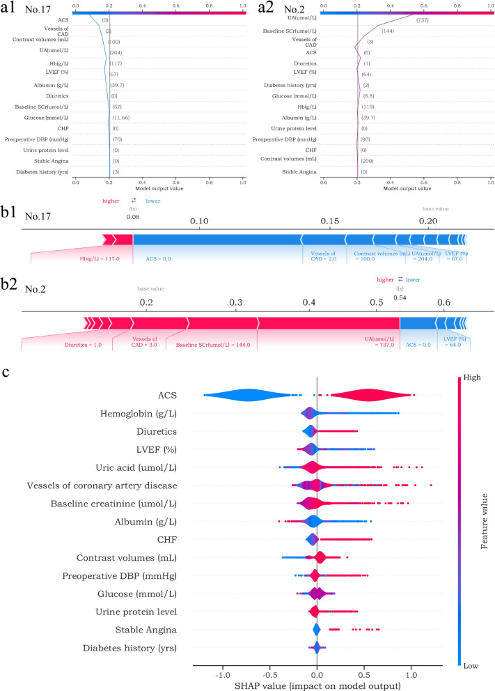
SHAP explains the contributions of BCPMD features to CIAKI. (a1-a2) SHAP decision plot of the 2 patients (No. 17 and No. 2). The plots depict the decision path for predicting CIAKI and can better visualize the impact of each feature on the occurrence of CIAKI at the individual level. a1 shows the example of patient No. 17 predicted to be non-CIAKI. a2 shows the example of patient No. 2 predicted to have CIAKI. (b1-b2) SHAP force plot of the 2 patients (No. 17 and No. 2). The features shown in red represent a higher risk of CIAKI, while the features shown in blue represent a lower risk. The plots help physicians identify the main features in the model that have high decision power at the individual level. c SHAP summary plot. Sort features according to the sum of all samples SHAP values in the training cohort. The SHAP summary plot demonstrates the distribution of each feature influence on the model output. The color bar on the right indicates the relative size of each feature. Red dots indicate high values, and blue dots indicate low values. The violin plots arranged on the median line represent the aggregation of each case in the training cohort. The distance between the upper and lower margins of the violin plots represents the number of cases with the same SHAP values offered by this feature

