Fig. 2.
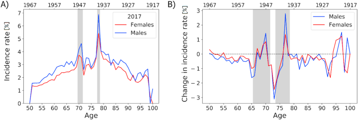
A) Age-specific incidence rates for patients aged between 50 and 100 for females and males in 2017. Birth years are shown on the second (top) x-axis. Results from the NIDEX model adjusting for patients with discontinued antidiabetic treatments. Grey vertical areas indicate patient cohorts that were born in years of famine. (B) Change in incidence rates over the years 2013 to 2017 for patients of ages 50 to 100. Red and blue lines highlight results from the NIDEX model for females and males, respectively. A general trend of decreased incidence rates in the NIDEX model can be seen, with two age ranges of increased incidence rates that can be linked with famine cohorts. (For interpretation of the references to colour in this figure legend, the reader is referred to the Web version of this article.)

