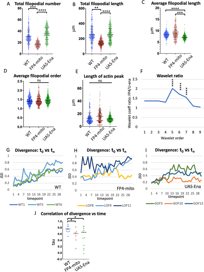
FIGURE 5.
Comparison of single growth cone parameters in WT vs. altered-Ena conditions. Values of indicated growth cone parameters were tabulated for all three genotypes. Statistical significance of differences is as indicated. Error bars indicate mean and SD. Statistical significance is indicated as follows for this and subsequent figures : *p < 0.05; **p < 0.01; ***p < 0.001; ****p < 0.0001. Comparisons that are not marked were not formally significant. See Materials and Methods for details of how significance was assessed. (A) Total filopodial number. (B) Total filopodial length. (C) Average filopodial length. (D) Average filopodial order. (E) Length of actin peak (square root of the global second moment of the actin distribution). (F) Plot of the ratio of the average coefficient for each spatial order of the wavelet transform for UAS-FP4-mito/UAS-ena. Wavelet analysis quantifies the spatial structure of the actin distribution, with higher-order wavelets reflecting the frequency of local actin concentrations at short length scales, and lower-order wavelets reflecting spreading of actin density at longer length scales (see text and Materials and Methods, and also Clarke et al., 2020b for additional explanation). The maximum at wavelet order 5 indicates that expression of FP4-mito causes the actin distribution to be spread out significantly on a length scale peaking at 6.5–25.6 μm, relative to that in UAS-ena, consistent with broadening of the actin peak by reduction of Ena activity. Asterisks indicate the significance of the difference in coefficient values for the indicated order between these two genotypes. For comparison of each altered-Ena genotype with WT, and table listing the spatial range corresponding to each wavelet order, see Supplemental Figure 3. (G–I) For each trajectory of each genotype, the JSD of the shape of the actin distribution was calculated between the first time point vs each subsequent time point. Divergence can vary from 0 (identical distributions) to 1 (unrelated distributions). For clarity, plots are shown here for only three illustrative trajectories of each genotype. For plots of JSD vs. time for all trajectories, see Supplemental Figure 4. (J) Tabulation of the correlation of JSD vs. time for all trajectories of each genotype (Kendall τ correlation value). Black bar indicates median value; asterisks indicate significance of genotype differences as specified above.

